 By Zoe Caleb
Interior design is a complex interplay of space, light, architecture, and texture. While structural layouts and wall treatments establish the baseline for a room, furniture serves as the primary visual and functional anchor. Among all the attributes of a furniture piece—including its scale, material, and silhouette—color exerts the most immediate and powerful influence on how a space is perceived.
Furniture color does far more than fill an aesthetic preference. It dictates spatial perception, influences human mood and behavior, directs traffic flow visually, and unifies disparate architectural elements into a cohesive home environment. Understanding the psychological, visual, and spatial mechanics of furniture color empowers homeowners and interior designers to curate intentional, functional, and beautiful living spaces.
The Psychological Impact of Furniture Color
Color psychology plays a central role in how humans experience interior environments. The colors assigned to major furniture pieces—such as sofas, dining tables, beds, and armchairs—trigger immediate sub-conscious emotional responses that set the emotional temperature of a room.
-
Warm Tones for Energy and Social Connection: Furniture featuring warm colors—including terracotta, ochre, deep crimson, rust, and mustard yellow—creates an inviting, energetic environment. These hues stimulate conversation and warmth, making them exceptionally well-suited for social spaces like living rooms, dining areas, and entertainment spaces.
-
Cool Tones for Tranquility and Focus: Cool colors—such as soft navy, slate gray, sage green, and powder blue—evoke feelings of calm, stability, and peaceful focus. Incorporating cool-toned furniture into bedrooms, home offices, and reading nooks promotes relaxation and mental clarity.
-
Neutral Tones for Balance and Flexibility: Neutral furniture shades—including cream, beige, taupe, warm wood tones, and greige—provide a serene visual palette. Neutrals act as emotional stabilizers, allowing spaces to feel open, timeless, and uncluttered while providing flexibility for seasonal accessory updates.
Manipulating Spatial Perception through Color Choices
One of the most practical applications of color theory in interior design is altering how big, bright, or open a room feels. Furniture takes up significant physical volume in a room, and its visual weight is determined largely by its surface color.
Light-colored furniture reflects natural and artificial light across the room, reducing visual mass. In compact living rooms or rooms with limited window light, incorporating ivory, soft gray, or light oak furniture prevents the space from feeling overcrowded. Light surfaces blur the boundaries between furniture and surrounding walls, making floor plans feel expansive and airy.
Conversely, dark-colored furniture—such as charcoal sectional sofas, espresso wooden tables, or deep navy leather armchairs—absorbs light and carries high visual weight. Dark furniture grounds a space, providing structural definition and intimacy. In large, open-concept rooms with high ceilings, dark furniture pieces anchor specific activity zones, preventing the room from feeling vast, empty, or uninviting.
Establishing Focal Points and Visual Hierarchy
A well-designed room requires a clear visual hierarchy—a guided path that leads the eye seamlessly from a primary focal point throughout the rest of the space. Furniture color serves as a primary tool for establishing this visual balance.
Creating High-Contrast Statement Pieces
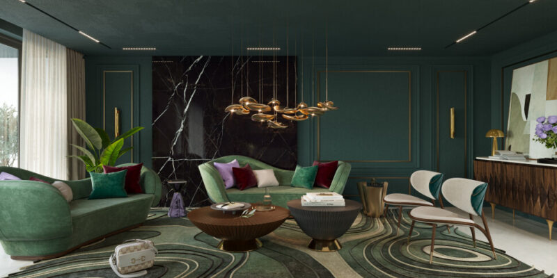
Using a bold, saturated color on a single major furniture piece creates an instant focal point. Placing a rich emerald green velvet sofa against a crisp white wall, or positioning a vibrant mustard yellow armchair in an otherwise monochromatic reading corner, draws immediate attention. The high contrast elevates the furniture item into a functional art piece, adding character and design intent to the space.
Monochromatic Harmony and Low-Contrast Integration
For a minimalist, serene aesthetic, low-contrast furniture integration is highly effective. Choosing furniture colors that closely match or softly complement the surrounding wall color creates a harmonious, monochromatic look. A beige linen sofa placed against a warm alabaster wall blends into the background, allowing architectural details, natural light, and subtle textile textures to take center stage.
Balancing Wood Tones and Natural Finishes
Wood is one of the most common materials used in furniture construction, yet coordinating multiple wood finishes across a single room often presents a design challenge. Rather than focusing solely on painted surfaces, interior designers evaluate wood as a distinct color spectrum defined by undertones.
To create a cohesive interior using wooden furniture, identify the dominant undertone across your wood pieces—whether warm red, cool ash, or neutral yellow:
-
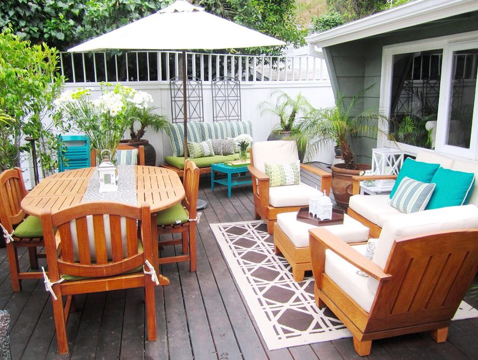
Warm Wood Undertones: Cherry, mahogany, warm oak, and teak feature reddish or golden undertones. They bring traditional warmth, elegance, and richness to living rooms and formal dining spaces.
-
Cool Wood Undertones: Driftwood, weathered gray ash, and bleached maple possess cool gray or muted undertones, aligning perfectly with Scandinavian, modern coastal, and industrial aesthetics.
-
Neutral Wood Undertones: Walnut and natural oak exhibit balanced undertones that blend effortlessly with almost any color scheme, offering unmatched versatility across mid-century modern and contemporary interiors.
Mixing different wood tones is entirely encouraged, provided you maintain a consistent underlying temperature across the room or use a dominant wood tone for seventy percent of the space while using secondary finishes for subtle contrast.
The Relationship Between Lighting and Furniture Color
The way furniture color presents itself inside a home depends heavily on the source, intensity, and temperature of surrounding light. A deep navy sofa that looks rich and vibrant in a sunlit showroom can appear flat or almost black inside a windowless room lit by low-kelvin incandescent bulbs.
Natural light changes throughout the day based on window orientation. North-facing rooms receive cool, bluish light that can make light gray or pale blue furniture look cold and clinical; warm-toned furniture balances this cool light effortlessly. South-facing rooms enjoy intense, warm sunlight all day, which enhances warm-toned furniture but can wash out delicate pastels.
When choosing furniture colors, always evaluate fabric swatches and wood samples inside the target room under both natural daylight and artificial evening lighting to confirm the color performs as intended across all hours.
Practical Strategies for Integrating Color
Incorporating color through furniture does not require committing to overwhelming bright shades across every piece. Applying structured color ratios ensures a balanced, professional outcome.
Interior designers frequently utilize the sixty-thirty-ten rule when planning room color distributions:
-
Sixty Percent Dominant Palette: This percentage represents the primary wall color, flooring, and major neutral furniture pieces that set the baseline tone of the room.
-
Thirty Percent Secondary Palette: This portion includes secondary furniture items—such as dining chairs, accent tables, or secondary seating—that introduce complementary colors, rich wood tones, or subtle patterns.
-
Ten Percent Accent Palette: The final ten percent features bold, high-contrast accent colors introduced through small furniture items like ottomans, side stools, throw pillows, and decorative accessories.
Applying this structured ratio prevents color overload while ensuring your furniture choices contribute meaningfully to a balanced, aesthetically pleasing interior environment.
Frequently Asked Questions
How do I choose a sofa color if I plan on moving to a new home in the future?
When choosing a major, long-term investment piece like a sofa with potential relocation in mind, select a versatile neutral color such as warm gray, beige, soft charcoal, or oat. Neutral sofas adapt seamlessly to different wall colors, floor types, and architectural styles, allowing you to update room aesthetics in a new home simply by changing accent pillows, rugs, and light fixtures.
Can you mix warm and cool furniture colors in the same living room?
Yes, mixing warm and cool furniture colors creates dynamic, sophisticated interiors. The key is establishing a dominant temperature (such as warm cream and wood tones) and using the opposite temperature (such as cool navy or sage green) as an accent. Balancing warm and cool tones prevents a room from feeling overly sterile or excessively heavy.
What furniture colors work best for households with pets or young children?
For busy households with children or pets, medium-toned tweed fabrics, distressed leather, heathered grays, warm taupes, and subtle patterned upholstery are ideal. Extremely dark colors like solid black tend to highlight light pet hair and lint, while extremely light colors like crisp white show dirt and spills easily. Medium, textured shades conceal daily wear effectively between cleanings.
How does dark furniture impact the perceived height of low ceilings?
Dark furniture can ground a room, but heavy, tall dark furniture can make low ceilings feel even lower. To maintain an open feeling in rooms with low ceilings, keep dark furniture items low to the ground—such as low-profile platform beds or low-backed sofas—and select lighter colors for vertical storage pieces like bookshelves and wardrobes to draw the eye upward.
Should dining chairs match the color of the dining table?
Dining chairs do not need to match the dining table color exactly. Matching sets can feel formal or traditional, whereas pairing a natural wood table with painted charcoal chairs, or a white marble table with warm cognac leather seats, creates a modern, custom look. Ensure the pieces share a similar scale and design aesthetic to maintain visual cohesion.
What is the safest way to introduce a bold color into a living room using furniture?
The safest way to introduce a bold color is through smaller, easily moveable accent furniture rather than the primary sofa or entertainment console. Start with a vibrant accent armchair, a colorful upholstered ottoman, a painted side table, or bar stools. This provides a striking pop of personality without overwhelming the space or requiring a massive financial commitment if your tastes change.
How can I make light-colored furniture feel cozy during cold winter months?
You can warm up light-colored furniture seasonally by layering rich, tactile textiles. Introduce warm-toned throw blankets made from wool or faux fur, add velvet accent pillows in deep jewel tones like amber, burgundy, or forest green, and place a plush patterned area rug beneath light seating to create an inviting winter atmosphere.
What is your reaction?
Excited
0
Happy
0
In Love
0
Not Sure
0
Silly
0